Documentation from September - end of November 2025
Considering Multiplate Layering in Lithography and Etching
When I returned to the studios after the summer break I had a clear idea of what I wanted to achieve practically in terms of technique. Aside from the Research Festival brief, I wanted to become more confident in various techniques before I left the Masters and started working as an artist on my own, forever-thankfully with the facilities at Hausprint Studio. I wanted to re-familiarise myself with lithography and aquatint and learn how to do photo-etching. Specifically, I became interested in building up an image with transparent layers in a similar way to my Japanese woodcut, but using different techniques such as litho and etching. I have been poring over a book of Helen Frankenthaler's prints, which goes into a helpful level of technical detail about this kind of layering technique.
Helen Frankenthaler's Stone Lithographs
Helen Frankenthaler had teams of people helping her to make multi-layer prints with sometimes 6 stones being prepared and printed. I am interested in trying to print 2 or 3 stones in layered colour, tracing from a photograph in a similar process to my woodcut prints.


Frankenthaler's multiplate etchings
I am also keen to try layering etching plates, particularly transparent layers of aquatint to build up an image. I don't know if I'll have time to try this fully before the course ends, but these things are in my mind as I look forward to making prints at Hausprint Studio.


Colour Lithography
Over the summer I had played with photographing objects against coloured lighting in an experiment to see how contrasting colours of light can affect the quality of the object. I have written about this in the next section of my Documentation.
The photograph shown is an example of my 'still life' arrangements with my cast resin fingertips. I traced the photograph onto a prepared litho stone with red chalk and planned each layer with the idea of using 3 stones to build up the image for an edition of lithography prints.

Digital photograph, 2025


planning sketches


Layer 1


Layer 2
I prepared a second stone, 'Stone B' to work on for Layer 2 of my edition. This involved another block colour of tusche which was printed onto each of the edition.


Layer3
Using a reduction print method, I used strong nitric acid to etch the next layer of the print. I really enjoyed this process as it can produce some very interesting qualities, which the light ink colours dont really pick up at this stage. However, it gives me ideas as I begin to layer more transparent tushe in darker colours onto the print going forwards.


Layer 4
Using the reduction print method again, I used acid and sandpaper to remove parts of Layer 3 image on the stone. On printing, I saw that the background was picking up too much of the ink so I used phosphoric acid to tidy up the edges. The addition of the 'shadow' tone has really started to pick out the forms of the image, and I'm pleased with the print at this stage!


Unfortunately, I won't finish all of the print layers before I submit my Unit 3 documentation, but I will outline here my intentions leading up to the print exchange Shared Surfaces: Trans-Atlantic Connections Through Lithography, which I will take part in. The print exchange requires an edition of at least 3 prints to be submitted and potentially posted out to The University of Brighton and University of Indiana.
I will be working on 2 additional colour layers for my print. This will involve drawing out more transparent 'watery' layers with tusche in colours of bright green, bright red and pale white-blue. I'm excited to hopefully be able to take part in the print exchange, and I'm so glad to become more familiar with the process of lithography before I complete my Masters and continue at Hausprint Studio.
Experimenting with Coloured Lighting and Photographing Objects

As previously mentioned, I have become interested in the optical effects of colour since discovering a digital, optical quality in some colour combinations when creating woodcut prints.
In the summer I began to read into some early colour theory, particularly Schopenhauer's On Vision and Colours, which I came across at the Tate Modern's Abstract Expressionism exhibition. Schopenhauer wrote this text in 1816 when he was 28 years old.
Schopenhauer wrote that colour is 'physiological'. He observed that when the eye is exposed to a colour, the eye then retains an after-image of a colour which is complementary eg. yellow- violet, blue-orange.
Untitled, Japanese woodcut print on Kitakata Select (detail), 2025

In Vision and Colours, Schopenhauer writes that:
'Colour is the qualitatively divided activity of the retina. Complementary colours are equal and opposite to each other.'
He writes about the material effects of colour; for example, making objects appear white by applying two complementary colours. He describes:
'A red rose, light shining through a piece of green silk. A lilac appearing white in candlelight, because of its yellow cast.'
I became very interested in shining complementary (opposite) colours onto objects and seeing, recording, photographing the effects. I particularly wanted to see red objects under a green light, I think because I had been seeing my art through such a red, orange, pinky lens of the body.
I used theatrical spot-lights and coloured filters to flood objects with coloured light. I was fascinated to see that the green light at its most intense made my red resin finger casts look solid black, like olives.


I began to experiment with 'cancelling out' colours with their opposite/complementary counterparts. Again, I was most interested in the way that red completely homogenised green within objects and photographs. I wasn't able to make anything appear white in my experiments, just black.


Red light on analogue photographs
I experimented with layering two different coloured lights to create chromatic aberration, blurred edges and shadows which often contain complementary colours, due to different wavelengths of light passing through the lens at different speeds.


At this point, I was starting to envisage my publication in the form of a photobook. I did some test printing on inkjet Awagami paper, and felt that the soft, slightly textured quality of the Japanese paper suited these kinds of images. I had started to call these object images 'touch objects' and began to plan the content of the book alongside my research.

Digital print on Inbe paper

Using Coloured Gel to show Surface
Reflecting on the quality of the resin fingertips on the screen, I feel that this showed so effectively the idea of surface and limit, virtual and material, I wanted to play more with this idea. I created some coloured gels from agar powder (alternative to gelatin) and food colouring. I sliced these into shapes and photographed them, firstly on a white surface, and then on a digital screen.
I need to edit the first two photographs as they are very shadowed, but they interest me because they seem to be made of nothing recognisable, just substance. I like the idea that we can look at something and know only that it is substantial.

The other photographs are the gels on a computer screen which is displaying an object. Even though the gel is a physical material, it has an extraordinarily digital quality. Like the edited photograph on the screen, it appears too lucent, too lush.


Models and Sets
I visited a wonderful exhibition at White Cube Bermondsey called Alien Shores which featured works on the theme of surreal, imaginary and alien landscapes. Alongside an amazingly alien sculpture by Marguerite Humeau, there were also a series of framed graphite drawings by the Indian artist Pranay Dutta which depicted constructed model-like landscapes. These made me think about how ideas can be contained and played out within the staging of a model. Particularly, it seemed a way to present research through playing with materials and concepts on a smaller scale. In Dutta's work, these large conceptions of sky, water and landscape become, to me, very intimate and precious object-worlds. The more I look at them, the more they draw me in.


Pranay Dutta, Proscenium I, II, II and IV. Graphite and charcoal on paper, 2025
One of my favourite artists, who I constantly return to throughout my practice, is the British artist Ian Kiaer. Kiaer often reflects on his use of the model in his installations, and these have also been at the forefront of my mind when considering how to present my research in a way that best suits me and the way I work and think.
Ian Kiaer: Tooth House, interview with Fabrice Hergott
Kiaer:
‘The model is important to me, and relevant to the idea of emergence and naming. The model can hold multiple associations and also remain unknowable. It could just be a very particular form that is impossible to describe, or a piece of material that stands in, or acts as a foil to something else. The model is both evasive and ridiculously precise.’
Kiaer:
‘I want to resist the idea of picture-making - I'm not really interested in creating a landscape of objects. One of the problems of photographing work is that it creates pictures that operate very differently from when you encounter the actual work, when you stand before it. It is not that you have all these fragments and the accumulation of them creates a picture. Creating a picture of a totalizing move - it creates something that is easily read or entered.‘
In this second quote, Kiaer highlights the difference between experiencing real objects in a space, as opposed to being confronted by a photograph of these objects. This is going to be the obvious difference between my exhibition work and my research festival images.

Ian Kiaer, Endnote (Ping). (exhibition view) 2020

Ian Kiaer, Endnote (Ping). (exhibition view) 2020

Ian Kiaer, Endnote (Ping). (exhibition view) 2020
Constructing Sets
I constructed a simple corner of a room from plywood in the workshop and made it big enough so that would house prints and smaller objects with the scale of a small room or exhibition space.


I found a piece of flexi-ply while looking for wood in the workshop, and decided to make a round set as well.


Once I had painted them white, I began to experiment with different light effects and camera angles. Having this space in which to work then allowed me to plan the objects which would inhabit it, and consider how I would present my research, what story I wanted to tell.


Consolidating my Ideas for the Research Festival
I planned to create a photobook to be displayed at the Research Festival, along with a written piece for the Online Journal Reflections. I wanted the written piece and the photobook to work together, though to be presented separately. I had considered that the writing could appear as a text alongside the publication, but having spoken to tutors, I decided that there might be better ways to do this. I was told that there might be an opportunity to talk through my publication at the Festival, which I will consider as I plan.
In a tutorial, my tutor Jo suggested that I could write my Critical Reflection/online journal piece in a more creative way than the traditional essay format. I showed her my proposed idea and she suggested that I construct the writing in the form of an encounter with the object, rather than an essay about the phenomenology of touch.
I drafted this as my plan going forwards:
The work imagines a haptic encounter with an object, detailed through a series of images which visualise touch through playful assemblages of sculpture, print and projection. Constructed in the form of diorama-like models, resembling miniature exhibitions, the artist’s interplay of material and virtual causes us to question the embodied, physical act of touch in a world of screens and object-devices.
Accompanying the images is a text in which the artist examines the phenomenological implications of touch through what she describes as the ‘material language’ of writers such as Merleau-Ponty and Derrida. Through dynamic, textural, often poetic material premises, touch is described as an embodied, physical process which acts as a fundamental hinge between us, the subject, and the objective world.
Using the Language of the Text
Throughout the end of Unit 2 and Unit 3 I have been compiling a list of quotes from the texts I have been reading which, to me, have these 'dynamic, textural, often poetic material premises'. I have been recording anything which conceptualises the sense of touch through a language which speaks to me materially, which makes me imagine crafting it in some way. All of the works in my summer exhibition were drawn from what materialised within the language of the research, stemming obviously from my own sensibilities as a maker.
I list them here, and they are mainly from Derrida's On Touching, though I have been influenced very recently by Cathryn Vasseleu's Textures of Light: Vision and Touch in Irigaray, Levinas and Merleau-Ponty.
-
We can only touch on a surface, which is to say the skin or thin peel of a limit. ‘To touch at the limit’.
-
A process of ‘feeling oneself feel’. I feel myself feel
-
‘The sense of touch has its appropriate place in the fingertips and the nerve endings, the papillae. These nerve endings inform us, human beings, about the form of a solid body’
-
‘The psyche is extended though not yet spatial, there is an internal extension’
-
‘Our world self-touches itself, it flexes, inflects, and reflects itself; it auto-affects and hetero-effects itself in this way; it folds itself, onto itself and yielding to itself. To be sure, it touches itself so as to become the world,but also to exit from itself
-
That is what sense is, in one sense – always renewed, always spaced out, in one sense and an other, in a corpus of sense and thus in all senses, but without possible totalization’
-
‘ as soon as it is touched, sense certainty turns to chaos, to tempest, and every sense to disarray. Body is certainty startled and shattered. Nothing is more properly of our world, nothing more foreign to it’.
-
‘where there is close vision, space is not visual, or rather the eye itself has a haptic, non-optical function’
-
‘There is an animality that can be seen only by touching it with ones mind, but without the mind becoming a finger, not even by way of the eye’.
-
‘The haptical clings to closeness’. It identifies with ‘the approach of the proximate’ it is ‘continuistic’.
-
‘It is the smooth and not the striated space that this haptical continuism finds, or rather seeks its element of appropriation, and it is there that it confirms and smoothes out its logic of approach’
-
‘There is never any pure, immediate experience of the continuous, nor of closeness, nor of absolute proximity’
-
‘where has experience ever encountered (perceived, seen touched, heard, tasted, felt) the purely smooth?’ or some ‘body without organs’ (Artaud’s greatest fantasy, a Christian fantasy’.)
-
‘Pure smoothness is the end of everything, death itself’
-
‘ There is no intact matter - if there were there would be nothing. On the contrary, there is tactility, posing and deposing, the rhythm of the coming and going of bodies in the world. Tact unbound, parting and imparting itself’
-
‘Only touch comprises a motor activitythat is properly its own - and hence turns it into something more, something other than simply a sense, more and other than simply the locus of a passive sensation.
-
P143- MP about movement and touch, the role of motility in perception: ‘it is not a consciousness becoming movement, but a consciousness reverberating in movements’.
-
MP - ‘every sensation is spatial’. Because the ‘primordial contact with a being.. And the coexistence of sentient and sensible, it is itself constitutive of a setting for coexistence , in other words, of a space’
-
P145 - MP ‘absolute knowledge is not detachment, it is inherence’.
-
The weight of an object in a hand, a force exerted - p151
-
‘At the top of the organs of touch is the hand , the whole hand, its surface and fingers.’
-
164 ‘The possibility that one can touch with one’s finger lays bare the complication that will make for a difference between digital touching and seeing: fingers can also touch each other ‘fingers touching fingers’ ‘double apprehension’ ‘double sensation’.
-
The hand has ‘phenomenological nobility’
-
P171 The self-relation of touch’. ‘When I touch myself with my hand or finger there is neither any haptical mirror effect, as it were, nor any insinuation of alterity’
-
‘In touching myself, since I immediately and simultaneously ‘feel from the inside’, if i may say so..’
-
‘And there with my habd, I touch the inside if my body by ‘feeling through’ a surface.’ There is touching through a surface.
-
Merleau P p187 ‘when my right hand touches my left, I am aware of it as a ‘physical thing’. But at the same moment, if i wish, a extraordinary event takes place; here is my left hand as well starting to perceive my right. The physical thing becomes animate.. An exploratory power comes to rest upon or dwell in it. Thus I touch myself touching, my body accomplishes ‘a sort of reflection’. The relationship is reversed, the touched hand becomes the touching hand’.
-
‘The body is a perceiving thing’, a ‘subject-object’.
-
‘It is imperative that that we recognise that this description also overturns our idea of the thing and the world, and that it results in an ontological rehabilitation of the sensible’.
-
‘There is no art of touching, for touching is a sense as threshold…Touching is the light/darkness of all the senses, and of sense absolutely.
-
..’ Barely to touch: to skim the surface’.
-
‘ after all, we grasp the unity of our body only in that of the thing, and it is by taking things as our starting point that our hands, eyes and all our sense organs appear to us as so many interchangeable instruments. The body by itself, the body at rest is merely an obscure mass, and we perceive it as a precise and identifiable being when it moves toward a thing’.
-
Artists may want to symbolize this ‘carnal thickness between thought and external things’
-
What makes the haptical cling to closeness, close vision, beyond touch..’the first aspect of the haptic, smooth space of close vision is that its orientations, landmarks and linkages are in continuous variation. It operates step by step’
-
For the most part, phenomena is not present in our consciousness, but are ‘hidden or withdrawn realities performing their labours unnoticed.’
-
‘Tactility is an essential aspect of light’s texture, where texture refers not only to the feeling of a fabric to the touch, or the grasping of its qualities, but also to the hinges or points of contact which constitute the interweaving of the material and ideal strands of the field of vision.’
-
‘The commencement of and participation in a tactile world occurs in the interplay between the two hands, each felt from within and accessible from without'
-
reversibility/reflexivity of flesh. Subject-object ‘the hold is held’ - hands touching
-
‘carnal light is not a transparent medium with its own clarity, it is the cloth or interlaced fabric of an anonymous visibility’.
-
‘A knowledge of light which which does not come through laws of perception, but through the correspondence between the appearances of things and our kinaesthetic unfoldings as bodies in a world’
-
‘Lighting supports our gaze as a background of sensibility’.
-
MP ‘ the lighting is neither colour nor, in itself, even light, it is anterior to the distinction between colours and luminosities.’
-
The constancy/quality of light is dependent on our bodily situation to it p46
-
Blinking ‘vision is formed in/between a dividing membrane’ p 50
-
‘Between the interior and exterior horizon of the visible there is a field of moisture, a fluid milieu renewing itself between the touching/dividing eyelids’
-
The image of hands touching like lips. ‘The indeterminacy of the ‘hands that touch without taking hold, like the lips’ constitutes the body as threshold or passage, neither an interior nor an exterior world’ p67
-
Irigaray calls this intimate and impercievable join of the flesh the ‘mucous’ ‘the most intimate interior of my flesh, neither the touch of the outside of the skin of my fingers, nor the perception of the inside of these same finger, but another threshold of the passage.. Between’ p67
-
‘Weaving back and forth, the world becomes a texture in which the subject sees both from inside and from inside-out’. p71
-
‘Images arent graspable. They have no depth, they are only visible. But their surfaces can be grasped with fingers, and fingers that lift representations out of the surface to grasp them can count them and account for them’.
-
‘What remains are particles without dimension that can be neither grasped nor represented nor understood. They are inaccessible to eyes, hands or fingers. But they can be calculated and computed’
-
Having disintegrated into particles, the world needs to be gathered together. We do this with instruments which are capable of grasping/gathering these particles - these are keys.
-
‘ if we want to gain some insight into the world in which we find ourselves when we press keys with our fingertips, we must look more closely at the matter of pushing keys’. P23
-
Keys have have minute effects, eg an electrical impulse. Or a gigantic explosion.
-
‘The verb ‘to touch’ means first a blind contact, in the hop of finding something by chance: an heuristic method’ p25
-
‘The hand makes humankind the subject of the world, the eye makes it the surveyor of the world, fingers make it the ruler of the world, and through fingertips, humankind becomes what gives the world meaning’ p28-29
-
‘Technical images are envisioned surfaces’ p33
-
When we look closely at a photograph we see grains. All technical images are composed of particles/grains.
I started to order the images that I had created so far into a kind of visual 'story', albeit told through abstract images. I began to connect some of the quotes to the images, and planning a new photoshoot, with objects, scanned prints and new silk prints.


Furred Grids
I began to use grids as a way to suggest a touch 'interface' when I layered the image of Millbank Tower over other bodily images.
Later, I had in my mind the construction of LCD screens, which use liquid crystals layered between a series of interfaces which are both horizontal and vertical. Where the pressure of a finger forces the liquid crystal to interact with any layers of intersecting lines, there is an input and the screen will trace the user's finger activity. I overlaid a diamond net-like pattern over the digital silk print to give the sense of both a cellular and digital surface, as well as to show surface literally as another layer over the image, something which comes between us and bodily world beneath.

Digital photograph, 2025
I had in my mind also, this painting by Phoebe Unwin on which she paints over printed grids. I began to experiment with printing the tiniest grids digitally onto a very fibrous Japanese paper called Shi-Oji.


Digital photograph, 2025

Phoebe Unwin, Man with Heavy Legs. Acrylic paint, ink, charcoal and pastel on card and printed paper. 2009
I found it fascinating that as the grids got smaller, they became less distinct as the ink became disrupted/completely absorbed by the paper fibres. The close-up images below are the printed grids scanned in at 1600 DPI, so the interaction between the ink and the structure of the paper can be clearly seen. Scanning paper prints at high DPI has become my new obsession; it feels like entering the stuff of the print itself. I'm particularly fascinated by the smallest grid, which becomes a spaghetti of faint CMYK fibres, and has the holigraphic glow I have written about previously.


Close up of largest grid
Scan of digital prints on Shi-Oji paper, 28 x 50cm

Close up of red grid

Close up of smallest black grid (approx 1.5 x 1cm)
I used a thin paintbrush to apply water to the edges of each printed grid on the front and back of the paper. I did this repeatedly until the water had sunk completely into the paper. I was then able to pull the paper apart, teasing out the fibres to create each 'furred' grid. I scanned these in onto black paper, and then began to experiment with scanning them over other imagery.

Wetting the edge of the printed grid

Scanned grids with furred edges


Scanned photograph with grids printed on Shi-Oji


Scanned photographs and prints with grids printed on Shi-Oji
Where the fibres touch and frame other images, I feel that I'm starting to create the idea of touching a surface, as well as the sense of nerve endings, rhizomatic systems where touch has a kind of trajectory.
I have also been drawing on a lot of the material language of Cathryn Vasseleu, in her book Textures of Light, in which she examines vision and touch alongside this idea of the textural, material quality of light. The clinging sense of touch acting as a material hinge between the object and subject is, to me, really exciting when I consider the textural qualities of these grids. I'm looking forward to using them in my model 'exhibition' as the 'touch interface'.
Photopolymer Etching
I hadn't done photopolymer etching before, and I was keen to try it before I left Camberwell. I was also excited to build up the digital image in this way, and vary the 'C M Y K' combinations to create interesting qualities of image. I was particularly interested to see how I could suggest the idea of an image's grain or particulate quality by using different transparencies and even mis-registering.
I sent my image and instructions to Hexio, and once I had the positives, I learnt how to expose them onto the plates.


The C M Y K positives laid out prior to exposing


Unfortunately, I only had time to print this once before submitting my Unit 3 for assessment.
However, I will outline my intentions going forwards and for my research festival publication.
Documentation of the plate exposure and first print

I was slightly disappointed by the quality of my first print because of the lack of density in the colour, which seems to muddy the darker areas of the image.
In part, I do have to consider the reasons for wanting to make this photograph into an etching, which is to render it into a new form. So I am careful not to compare it too much with the original photograph.
In my next prints I will use a more pigmented black and tone down the yellow which seems to be too jarring. I will also print onto a smoother paper, as Somerset seems too textured.
I want to experiment with ghost-printing and using very transparent inks in different combinations.
Photo etching on Somerset paper

Digital scans of photo etching
I will play with this image digitally to see if it fits into my research festival photobook. The shimmery, textural quality of the print seems to chime with the ideas of ambiguity in perception, so I will experiment with printing close-up sections of the print.
Finding Inspiration from Artists' Photobooks


Lucas Dupuy's 2022 publication which accompanied his exhibition in Belgium, has led me to consider the flow and uniformity of the book. Dupuy's images are various, but they are all produced in this soft grey-brown. I will produce a much more colourful set of images, but I want them to be coherent, which means careful editing and curating.
Lucas Dupuy, Formless Anxiety, 80gsm Uncoated Holmen Book Cream Inner Pages, 24 x 14.8 cm. 2022


One of my favourite photographers Rinko Kawauchi has produced many beautiful photobooks. I was able to view these two at the V&A Special Collections library, and I have returned to these images when considering my own photobook.
In particular, Kawauchi often uses the whole spread of the double page so that the images are as large as the pages themselves. I aim to print my pages approximately this size, around A3, and to make use of the space of the page.
Rinko Kawauchi, Halo. 315 x 230 mm, hard cover, 96 pages. 2017


In this book, which documents controlled fires in Japan's rural communities, each page as an inner leaf which often contains inverted or altered colour versions of the main photographs. These have the suggestion of inner surfaces and alternative worlds.
Rinko Kawauchi, Ametsuchi. 45 x 240 x 15mm, hard cover, 160 pages, Clothbound Binding 2013


Miho Kajioka, And, Where Did the Peacocks Go? Softcover with flaps Japanese folds in a slipcase, 230 x 190 mm. 2018
Kajioka is a photographer who works with intimately framed silver gelatin prints often depicting scenes of quietude. Her book includes even sparser versions of these photographs, which appear almost burnt into the Japanese paper and are often small sketched details within negative space. The text is hidden beneath the folded pages, and often reads like a memory or disparate thought.
I love the softness of the photographs on the Japanese paper. I aim to try printing my photographs onto Inkjet Japanese paper so that I have this softness but I am able to print the colours as close to the photographs as possible.
Touch Objects and objects to be touched
In the photobook 'narrative', the yellow object is the object which is approached and touched, and through which the 'materiality of touch' is explored. I will use the resin fingertips to show the location of touch. I sent both images to the fabric printing company Contrado and received each image printed on silk, the same fabric as used in my Summer Exhibition.


I wanted to make the silk into plush cushioned objects which had a button upholstered surface, the kind of finish that is usually seen on furniture. I imagined stretching the silk taut into 'finger holes', suggesting a pressure from both outside and within the object, concentrated into these points.
I was also inspired by the architectural designer Eric Giragosian, who worked on finding various forms of vaulting shell structures, using inflated latex within clamps of MDF.


Eric Giragosian, Inflated Vaults. MDF, latex, metal fixings.
I traced the shapes of the silk objects and cut them out of thick ply with a bandsaw, using the belt sander to round off the edges. Then I marked out holes onto the ply and used a pillar drill to drill them all the way through the wood.
I then traced the shapes onto memory foam and upholstery foam and used a hot wire to cut the pieces out and round them off. It was horribly fumey, so I finished shaping the pieces with fabric scissors.

Sketch for the yellow object


Documenting the process of making the plywood bases and the foam shapes


With the fingertip prints, I glued the foam to each plywood base, and then pinned the silk prints in place. I then sewed up through the holes in the base and back through to pull the foam layer downwards at various points. The effect was much less geometric than I'd hoped, but I was pleased with them once I had stretched the fabric over the base. I would like to be able to learn how to do the 'proper' button upholstery, but on this tiny scale I was glad to keep it simpler.

I photographed the yellow object silk piece throughout the photoshoot in various forms, including draped like a curtain and pulled like a landscape over the foam and plywood base. I chose to sew it onto the base in the same way as the fingertip objects, but it didnt have the same compactness as these. I actually ended up unpicking the threads and really enjoying the puckered creases they had left in the silk, reminding me of shibori, and I chose to include these in my main photographs.


Main photoshoot for the Photobook Touch

I hired out a DSLR camera, macro lens, short-throw projector, LED light and tripod from the University loan store. At home, I set up my square room set and the equipment and then used the day to play with the objects and prints within the set.
I kept my camera on the tripod all the time, with markers on the floor, so that I could keep a consistent shot of the set for images which took in the whole space. The other camera, with the macro lens, I was able to use to photograph objects in the scene very close up. I loved using the macro setting to capture the fine textural details and surfaces; I think this really aligned with my writing about close haptical proximity.
Set-up for the photoshoot, with model set, camera and tripod, and projector
I used the short-throw projector to cast various textures onto the surface of the model, which worked particularly well with the grid lines when envisaging the orientation of touch as contour lines and mapped surfaces.


Documenting the photoshoot
The projection also gave an intended 'virtual' surface to some of the images, a virtuality made with texture of light, a reference to the text by Cathryn Vasseleu which became such a rich source of material language.


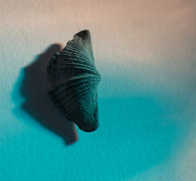
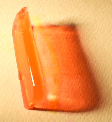
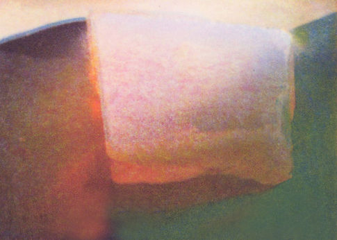
Images from the photobook Touch
I tried to photograph each image in an order which matched the structure of my written text The Materiality of Touch. Many of the images accompany passages within the text, but I want the photobook to work alongside the writing, visualising the materiality within my ideas.
I present the photographs below in the order which I intend to present them in the book. Each pair represents an open double page. Where there is a gap, the previous photograph will be printed on a thinner, one-sided paper.
I have test printed on a sample pack of Awagami Inkjet papers, and I have selected a double-sided bamboo paper for the majority of the images, and a thinner Inbe paper for the one-sided images.
Each page will be 28.7 x 35cm, making the book 76 x 28.7cm in dimensions when it is printed.


Using Indesign to Format the Photobook

The Materiality of Touch: Essay and Artist Book
I will publish my Critical Reflection essay The Materiality of Touch in the online journal Reflections. I will also print the text and images in a small hand-made book which will be made from the Japanese paper Shi-Oji. Each page of the book will be pulled and furred at the edges, exactly in the same way my furred grids were made. The book will present text and image on consecutive pages, and will be small in size, approximately 21cm x 14cm when displayed open.

Experiments with Shi-Oji paper

