Summer Exhibition Proposal
Link to my Summer Exhibition Proposal
https://docs.google.com/document/d/1wbFSiMIbraQK8GgAB_olHXechNQqz7n2fZ30vVCkg10/edit?usp=sharing


Draft Proposal for Research Festival
My initial idea for the Research Festival is to make a sculptural book, or a series of 'book objects' which would be presented as art objects.
My alternative idea is to make an essay-film, perhaps a series of photographic stills/moving image segments to be played out over my voice, with subtitles.
Documentation from February - end of May 2025
From Unit 1 to Unit 2
The pop-up exhibition in December challenged me to consider how my work might be displayed in a public setting. The experience of placing works together, in digital and print form, felt like an important step in my practice. Writing this some time after the show, I think my tutors were right that the display worked best in the form of a research table, a work-in-progress arrangement in which the film played out amongst and beneath the paper prints. Since working with the material from my Millbank exhibition research and visiting archives myself, I like the idea that the work can have the look of a research-in-progress, a collection of materials connected through their juxtaposition.


I have listed again my 'next steps' from the end of Unit 1:
-
Develop a coherent piece for the Millbank exhibition in January
-
Create mock-up installs to test arrangements and meaning-making
-
Print, paint and draw on top of photographs - the 'embodied mark'.
-
Apply a light-sensitive photographic emulsion to the surface of prints.
-
Research Derrida's 'On Touching', Julie Kristeva and Phenomenology.
Researching Millbank Tower

Describe your image


Describe your image
Describe your image
The structure of the prison is fascinating to me; it was set out in a central hexagonal shape with six pentagonal wings which have the look of geometric petals. Although, Millbank was not build to Bentham's panopticon design, the structure had a circular form and central 'surveillance' point, with cells surrounding the inner walls and a stagnant moat surrounding it.
The MA Fine Art cohort were invited to propose ideas for a series of group exhibitions on the 27th floor of Millbank tower, a 120 metre-high skyscraper next to Tate Britain. The exhibition space is office-like, but large and with incredible views over London. We weren't able to visit the space in advance of the exhibition, which concerned me more than I had expected, both logistically and in terms of my impetus for making the work. The specificity of the place interested me, and I wanted to create an artwork which referenced the setting.
In researching the site, I quickly learnt about the history of Millbank as the site of Millbank Penitentiary. Jeremy Bentham, designer of the panopticon prison structure, drew up plans for what he termed Britain's first national penitentiary. In 1799 Bentham purchased a marshy riverside area of London which would be known as Millbank. However, after some difficulties, Bentham's project was abandoned and in 1812 a competition was held to find a new architect. Eventually, the design and building of Millbank Prison was undertaken by Robert Smirke who would go on to design the British Museum in 1823. When it opened in 1816, Millbank Penitentiary was the largest prison in Britain.
I learned from my research that the guards and inmates struggled to navigate the 'labyrinthine' building. In a periodical of 1865, the Penny Illustrated Paper, the prison is described as a 'geometrical puzzle' and an 'eccentric maze'. The paper describes: 'Long, dark and narrow corridors and twisting passages, in which the visitor unaccustomed to the dubious twilight has to feel his way; double-locked doors opening at all sorts of queer angles, and leading sometimes into blind entries'

The first group of prisoners to enter the Millbank Penitentiary were all female, the first males arriving seven months later in January 1817. According to various sources, prisoners were forced to keep silent at all times and conditions within the prison were 'atrocious'; lack of sanitation leading to regular outbreaks of cholera, malaria and dysentry.
In 1823 the Morning Chronicle reported: 'The two chief sources of disease, incident to man, are marsh-miasmata and human effluvia. In the Penitentiary these sources are not only combined but concentrated. It is seated in a marsh, beneath the bed of the river, through which the vapours from stagnant water are constantly exhaling.'
By 1843 the prison was deemed so unfit that Parliament decided that it was no longer safe to hold prisoners there long-term. The site was further used as a holding facility for prisoners who were awaiting transportation to the Australian penal colony. in 1890, Millbank Penitentiary finally closed and was demolished within the next couple of years and eventually became the site for The National Gallery of British Art, now Tate Britain.


I walked around the perimeter of what would have been the prison and came across little more than a section of the moat which now runs between the housing estates and is used to grow plants and hang clothing. Apparently, the marshy ground of Millbank presented so many problems for the builders laying its foundations, Smirke had to devise a large concrete 'raft' on which to construct the building.

Historical bollard reads: Near this site stood Millbank Prison which was opened in 1816 and closed in 1890. This buttress stood at the head of the river steps from which, until 1867, prisoners sentenced to transportation embarked on their journey to Australia.

A perimeter trench or moat which held stagnant water in the time of the prison. Now it forms part of the housing estate along Cureton street.
The large photograph below really struck me when I saw it; an aerial photograph of Millbank Prison, photographed from an air balloon by Griffith Brewer in 1891, shortly before it was demolished. The form of the building seen in this context makes it appear relic-like, almost like a rose window, seeming dusty and indistinct in the aged photograph. The aerial viewpoint was important because I imagined the perspective being something like looking from the 27th floor of Millbank tower where the exhibition space was to be. I decided to work with this photograph alongside my own photographs looking up at Milllbank tower.

Aerial photograph of Millbank Penitentiary taken from a balloon in 1891
Digital Experiments: The Building as a Body

Photograph of Millbank Tower

Digital edit

I have been working with my photographs of Millbank Tower, paring them down to cell-like grids in bodily colours. I have been looking into the idea of haptic architecture, haptic in the sense of touching or perceiving the world from the inside. I'm interested in playing with this idea of looking through the stuff of the body. David Brubaker, in his essay examining Merleau-Ponty's Eye and the Mind, writes about a 'carnal thickness between thought and external things'.
Combined with this is my personal unease around high rise buildings, a sense of instability which is almost vertiginous, and a sense of space combined with claustrophobia, all of which feels distinctly psychological. Take away the building and the sense is similar to the experience of anxiety, a Kierkegaardian sense of freedom about being a body, untethered in space. The building becomes the skin, the membrane that we live within and which contains us within this space.
In the digital photograph, I have used a still from a film I created in which my hand interacts through an obscured surface, layered beneath the facade of Millbank Tower. I wanted the building to become something like a membrane. I am also interested in the idea of the hand interacting with the grid structure of the building, almost like an interactive screen. There is some sense of the digital, the virtual alongside the sense of the body.

Digital photograph, 2025
Film still, 2024
Further Digital Experiments:
I continue to be drawn to artefacts, particulary those which depict the body or parts of the body. I photographed the statues below in Crystal Palace Park and I especially liked the incomplete, limbless and truncated figures.


Digital photographs, unedited
The black and white versions of these become particularly ambiguous, particulary the torso on the 'raft', which makes me think of horrific deaths of sea migrants whilst also evoking museum storage; something about the care in which we treat artefacts in contrast with human lives.


digital photographs, 2025
Here, again, I have combined the hand film still with the statue figure, testing out imagery and meaning-making. This example furthers the concept of 'relic-touching' which I I explored in my film and print installation at the pop-up exhibition. I like the way that hands mirror eachother, both touching from the outside-in, but from differerent perspectives.

Digital photograph, 2025

Digital photograph, 2025
I began to digitally incorporate the figure statue with the photograph of Millbank tower. I wanted the building facade to merge in with the stone of the figure, to become like a skin.
I also experimented with duplicating the image into odd symmetrical compositions which came to resemble lungs in the first instance. Positioned the other way, it looked like a comical kiss.


Digital photographs, 2025
Dipping the print in wax: preserving, framing, making the print into an object/skin


I'm interested in finding ways to transform print into sculpture; framing or encasing in ways that the frame or surface is fused to the print itself, like a skin. Casting wax is fairly flexible and I hoped that it wouldn't be too fragile when hard.
Wax is used to seal the back of reliquaries and authenticates the relic as the 'genuine' artefact. In this case, the wax print is the proof of the object's spiritual endowment and signals its enclosed, untampered state.

I became really excited at the quality of the torso/Millbank photograph dipped in wax. The ordinary printer paper became skin-like and transluscent. I purposely tinted the wax blue so that retained a slightly cold milky tone. The wax made the print into an object; the torso/building had a rigid skin-like form.


Monoprinting onto Digital Print
As I increasingly use photography and digital print in my work, I have been considering how I can bring drawing, painting and manual mark-making into the image. I love the photographs of Vivianne Sassen which combine glossy digital photographs with ink and Posca pen. I am very interested by the painted mark interacting with the photograph beneath and the odd sense of depth created when the image almost quivers beneath the ink. I like it when something disrupts the digital image, almost like when a speck of something lands on a film screen and we are drawn back to the physical.


Archival pigment ink and Posca pen on digital prints, 2021
I enjoy using Photoshop to experiment with the colouration of photographs. I have recently been using a Pentax Super Me 35mm to take analogue photographs and I love the grainier quality of these images.


Digital photograph from 35mm film, 2025
Digital photograph, 2025
I experimented with monoprinting onto some of my digital prints. Some of these work better than others, and I find the process more intruiguing than the results.

Digital photograph with monoprint on Canaletto, 20 x 18cm

Digital photograph with monoprint and hand painting on gloss photo paper, 15 x 10cm

Digital photograph with monoprint and hand painting on Canaletto, 24 x 18cm
I printing the Millbank torso image onto a cream Somerset and used the large Monoprint press to apply ink in multiple layers. I wanted to see how monoprint could work with the layered qualities of the digital print.

Digital print on Somerset paper, 59 x 84cm, 2025


I love the process of building up the layers of Monoprint, though it felt much more pressured working on the digital print as the stakes were more costly if I messed up a layer.
Do I think the monoprint works on the digital print? Not entirely. It works in the body of the building, where the window grid merges with the painted marks, and there is more ambiguity between painting and photograph. Elsewhere, it becomes too intentionally painted, particularly around the hand.

Digital print on Somerset paper with monoprint, 59 x 84cm, 2025
The Aerial View of Millbank Penitentiary
Since finding the archive photograph of Millbank Prison which was taken from an air balloon in 1891, I desperately wanted to use it in the Millbank Exhibition in some way. I found the image at Alamy (online site for stock photographs) and was able to purchase a larger version so that I could print it as big as possible while still retaining detail.


I started to play with the unique shape of the prison as seen from this viewpoint. I took the petal-like pentagonal wings of the building and used these as a template for digital cutouts of the hand image I had created previously. I imagine them as bodily cells, and now seen as part of the prison, the gesture of touch seems to be one of containment, and reflective of a haptic sense which has become increasingly important to my work.


It became important to situate the viewpoint of the air balloon image with the perspective of the view from Millbank Tower. Eventually, we were able to visit the exhibition space, which allowed me to take photographs from the window looking down onto the Millbank prison site, now Tate Britain and the surrounding housing estates.
Digital photograph, 2025
Digital image, 2025

Photograph from Millbank Tower with digital drawing showing the prison site

Photograph from Millbank Tower with digitally layered image of the prison site
By layering the archive image over my photograph of the present view from the gallery, I was able to adjust the perspective of the historical photograph to mirror the viewpoint from the Millbank Tower window. I wanted to attach the photograph to the window so that the curve of the river and the bridges, the only similar details, would be viewed together.

Puzzle Pieces, Play and Cells
I
In working with the pentagonal petal shapes of the prison design, I was interested in the flower-like decorative form of the building which seemed to be also relic-like, like a rose window of a Church or something medieval in design. I was interested in this form in contrast with the panopticon design of the prison function. Though, interestingly, a panopticon in the design of Bentham would have an all-seeing guard in the centre, whereas in Millbank prison the central hexagon housed a chapel.


I experimented with the pentagon shapes as tesselating puzzle pieces, with the idea that they could be moved and placed in multiple arrangements. I'm interested in objects that can be played with and from which new meanings can derive. I imagined that the piece could be interactive, like puzzle or game counters.


When I was a teacher I taught an A-Level Art project which involved students researching Lygia Clark's bichos or critters sculptures. I gave them the task of designing and creating a sculpture which could be moved and re-shaped into different versions.

Lygia Clark, Bicho (maquette), aluminium, 1960 (20 x 33 x 18 cm)

Clark's sculptures came to mind when I was imagining my hand pieces as movable parts that have the potential to become interactive. I wanted part of my artwork to feel playful, to be handled. I like small sculptures that you can imagine holding and interacting with.
Installation view, Lygia Clark’s Bichos, 1965
Testing Pewter
I was intrigued to see if paper, and therefore digital prints, could be dipped into metal. After speaking with Lyndsey in the foundry, she seemed confident that the melting point of pewter was low enough that it wouldnt burn paper. I melted fragments of pewter in a cast iron ladle mounted onto bricks and propped over the gas stove.
I wanted to test ways of dipping and pouring molten pewter on the edge of my paper prints. I printed them on a thick Somerset and cut some out with scalpel, and others I tore or fringed the edge as I though this might help the pewter to adhere to the edge.


My purpose in using metal was the idea of creating weighted counters which still had the paper surface but which became solid and object-like. I was also drawn to the idea of the frame or weighted element being a definite part of the print. In my mind I was thinking of the print as the relic and the metal as the reliquary. I also keep returning to methods which make the print into an object.
I poured the molten pewter around the edge of the paper onto sand. If the ladle had a small pouring spout this might be a more controlled outcome, or if I created a mould around the edge of the print into which pewter could be poured.
The prints with the torn edge picked up the pewter, only if it was at just the right stage of being almost solidified.


I tested the pewter on the feathery edge of some Japanese paper, and the metal clung to it beautifully. I loved the quality of the thin paper with the delicate weighted edge. Pewter just slid off the edge of gloss photographs, but adhered when dripped onto its surface.

Kitakata Green paper with pewter, 2025

Photograph on gloss photo paper with pewter, 2025

Digital print on Somerset paper with pewter, 2025

Bettina Speckner, brooch, photo etching in zinc, silver, gold, 10 x 7cm, 2015

Bettina Speckner, Alutype, silver, diamonds, paint 6.5 x 10 cm, 2018

Bettina Speckner, Alutype, silver, diamonds, 6 x 10 cm, 2018
Wax-Dipped Print

After speaking with Jo in a tutorial about the range of works I had created so far, I was encouraged to create a larger version of my wax-dipped print. I printed two versions onto Pansion white, a machine made Japanese paper which has some transparency. I then used a scalpel to cut around the image.
The technicians in the wax room let me set up the space as I needed, and I bought a large amount of wax pellets, both parraffin wax and another wax labelled 'Micro'. I melted the wax and added a small amount of blue pigment to give some sense of the colour of Millbank Tower from my photographs.
When the wax had cooled enough so that it would form a 'skin' on the paper, I rolled the smaller of the prints slightly and dipped it one way and then the other into the wax, using an old paintbrush to coax the melted wax upwards. Then I hung the print using bulldog clips.
Seeing that this had worked, I then repeated this with the large print, which was much more difficult to cover. There were some drips and uneven thicknesses which distorted the image too much, so I found a way to heat the rounded handle of a metal knife and scrape it over the front and back of the print to smooth its surface.
This scraping action and the upside-down curved torso made this action feel like I was preparing an animal skin. I enjoyed the process of smoothing the buttery wax with the knife. It made me think afterwards of Joseph Beuys and animal fat.


In playing around with the smallest torso wax-print, I knew that it worked best when stood up in its curved form. I was also excited by its transparency; it seemed that wax worked almost like grease on paper to increase its transparency. I devised a small wooden maquette which held the print upright and also became like a spine which appeared as shadowy forms through the print.


The sculptural works of Danh Vo have been inspiring to me when devising the display for the wax-print. I considered metal versions and the possibility of dipping the stand into the same wax so that it became more integral to the materiality of the print. However, Danh Vo's wooden structures become devices which contain and support the sculptures whilst also staging them in temporary-seeming arrangements, recalling museum storage or transit. They are what partially construct the meaning of his works.

Danh Vo, Untitled, Venus torso, Roman marble, Ist century CE; bronze cast of the lower legs and feet of Vo’s partner, the artist Heinz Peter Knes, with feet crossed and toenails painted, Shivakashi granite and standard construction wood, Variable dimensions. 2021

Danh Vo, Untitled, 1st–2nd-century CE Roman marble torso of male, 1st–2nd-century CE Roman Apollo of Asklepius and pinewood, 179.5 x 59 x 68 cm, 2024
I spoke to Neil in the wood workshop about my design and he advised me on the type of structure which could work. Through our conversation, I came up with a new design which would I hoped would evoke the idea of a hand supporting the print and fingertips touching the skin.
I used dowel rods for the supports because Neil was able to give them to me, and the rounded form suited the idea of fingers. I used a large protractor to work out the angle each 'finger' needed to be to touch the print in a hand formation. From this measurement I was able to saw each piece to the right length.
I learned how to use an angled drill to create holes which each dowel could point from at the correct angle. I love this sort of work; learning new skills and practical problem-solving. I created a proto-type in a thick piece of wood to make sure the angles were correct, then I traced the position of the holes into a thick piece of ply which I would use as the base, and used the angled drill to create the holes for the dowel.


I used a jigsaw to cut the base into a rounded shape like a palm, and then used a router to round off the edges. I also sanded the tip of each dowel so that they would lie flat against the print, and I rounded them off to give them a finger-like form.
I experimented to see if wax would stick the back of the print to the dowel, but it was too unstable. After some help from the technicians, I embedded small magnets into the base and fingertips of the dowel, which worked well as it meant I could transport the work in parts and put it together in the gallery space.


Sketchbook pages
Hand Tokens

I wanted to situate the hand prints alongside the aerial photograph of Millbank prison so that I could create the visual link between the flower-like form of the prison and the arrangement of the hand pieces. Initially, I had thought of presenting them together on a table, as in the form of research or archive material.
I found out that I was allowed to display the aerial photograph on the window of Millbank Tower, which resolved that the hand prints would work separately, installed near each other. I wanted the hand prints to become more sculptural, like puzzle pieces which had the potential to be placed in different arrangements, possibly on the floor beneath the window and the photograph.
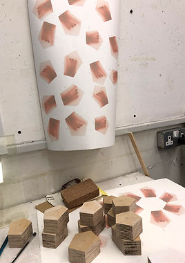

Neil gave me some amazing thick ply from the workshop, which I traced the pentagons onto and used the band saw to cut, then the sander to refine the edges.
I printed the hands onto Pansion White, the same machine-made Japanese paper as the large wax print. Then I used spray mount to stick the cut-out hand photographs onto the faces of each shape.
The layered ply was visually reminiscent of the Millbank building, so I painted a diluted light blue acrylic paint into the edges of the pieces. The pigment was absorbed into some layers of the ply more than others, so there was an interesting quality to the surface which I will remember when considering future pieces

I call them hand tokens because they are tangible representations of something to do with touch, gesture, the body and play. Tokens may also stand in as a kind of currency, something given, something which activates. They slot together and into each other like cells or building blocks.


Installing at Millbank Tower
Most of the curatorial decision-making for the show was done by the tutors, but I was pleased that I was able to use the space next to the window which had the view down to what would have been Millbank Penitentiary. I was also able to spend a lot of time playing around with the works, arranging my hand tokens in correspondence with the shape of the prison in the photograph.
installation images


I had originally envisaged my wax sculpture on the floor of the gallery, but I found it got visually lost on the odd carpet, and so I was allowed to prepare a plinth and display the piece on this. I think it was the best option given the space, but I was never entirely sure about presenting it so 'traditionally' as a sculpture. If it had been a white cube space, the floor would have been the best option. The wax sculpture might have become an architectural 'model' as in Ian Kiaer's installations, and therefore might have been the tower block within the landscape of the prison (the hand tokens). They might have corresponded better.
It was important that the three components of the installation worked together; related to one another: hands, layers, pentagonal flower. I felt that the work hadn't really been made until it was installed in this specific place, which really excited me. Everything felt that it came together freshly and through the act of playing with the installation. I want this energy and way of working to continue into the summer exhibition. I want the works to roll into one another as a continuous act of making and playing and re-making...

Installation, Untitled. Digital prints on Japanese paper, wax, plywood, acrylic paint, wood, magnets. 2025
Installation detail
Digital print on Pansion White paper
2025


Installation detail
Digital print on Japanese paper, wax, wood, magnets
2025


Student works, Millbank Tower Exhibitions
2025


Critical Feedback for the Millbank Works
Following the exhibition, we had a silent crit which involved my peers and tutors talking about my work for about 10 minutes whilst I listened and was not allowed to speak or respond. Afterwards I was able to respond and reflect on their feedback. I hadn't received much feedback for my Millbank work, and I was very interested in hearing the responses and reactions to the work.
I jotted down as much as I could throughout the crit. Below are the discussions from peers and tutors:
-
Integrity of the support
-
Bodily
-
Wax piece - torso, woman, stone imprinted
-
Ghostly - touching from behind
-
The photograph - a map? approaching a distant planet
-
The blocks - child's play, invites us to play
-
J G Ballard
-
Flower shape - does it have a meaning?
-
The layering of the ply blocks reflects the building, and the colouration
-
A relationship to material. Do we need the digital print?
-
The sculpture responds to the light. Changes. Temporality.
-
Is it one work or three?
-
All work alone, but are related
-
Can't help but think of Grenfell - pulling it down
-
The blocks - fingers. What is the gesture? An unexpected gesture.
-
Stacking - the layers are mirrored in the sculptural piece
-
Could they (the blocks) be more delicate?
-
The hands - redness like a baby before birth
-
Hands trying to get out. Domestic violence.
-
(Wax piece) Antiquity, embracing modernity? A monument.
-
Tower Block - the building as a body
-
Different ways of looking at space
-
Distance and proximity
-
Being inside and outside
In my response, I explained that I was pleased with the feedback, as it contained a lot of ideas which I had been wanting to convey.
In this crit and in recent tutorials I have had positive feedback about the hand blocks, or the 'hand tokens' as I have recently called them. The painted ply has layers suggestive of architecture, and, as someone pointed out in the crit, mirror the quality of wax print. I was surprised and pleased that someone saw child's play in the blocks, and the invitation to touch and play, the idea of stacking, of arranging
The allusions to Grenfell Tower, and domestic violence ('hands trying to get out') were interesting to me. Yes there is something about being trapped in the hand image, something about being trapped behind a surface or a membrane. But also something about trying to communicate, gesture through that surface. The surface, the membrane, the window, the screen - these are all the mediums of touch. Yet they can not break through and come out of their object-ness. Someone said 'could they be more delicate?'. I think they could be as delicate and contained as drops of water, with flickering embryonic hands trying to break out of the membrane/meniscus.
There were some questions about whether I needed the prison photograph; the digital print. I was, and still am, so taken with the aerial photograph, that it brought the whole experience of the Millbank exhibition alive for me. Whether source images can still be the ignition of a project, and yet not be exhibited.. Perhaps the photograph could have been an artwork on its own, separate from the sculptures?
The last two points are really interesting: distance and proximity, being inside and outside. As I research the haptic sense and the idea of touching and perceiving from within the body, I have been trying to imagine, both abstractedly and materially, this process of perception through the stuff of the body. There is a puzzling sense of what is inside and what is outside, and what happens in this layer, this bodily medium. Distance and proximity refer to vision and perspective, but also to scale. It leads to me to think of Ian Kaier's architectural models and how they interplay with the other works in the installation, redefining through our sense of scale.
Hand Tokens


Pewter and Print


I wanted to find a way for pewter to adhere more readily to the edges of the print. It seemed that the rougher, fluffier edges worked better, so I thought to apply something to roughen them further.
I painted fine carborundum powder mixed with acrylic medium onto the edges of small torn pieces of print. I also painted the edges with glue and dipped them in the powder.
The molten pewter did adhere much better this time. I still had to wait for the metal to be just on the edge of hardening before dipping the paper. I could gauge this when the pewter started to become crystalline on the top. The acrylic medium and carborundum paste worked best.
Most exciting was the way the pewter gave the print the weight and form of a sculpture; the metal forcing the Japanese paper into different folded arrangements. I think of the metal as an integral frame; a reliquary of sorts, giving the print an object-ness including weight, tension and dimensional form. Again, the folding bichos or critters sculptures of Lygia Clark were an inspiration.


Japanese woodcut print on Shoji paper, pewter. 12 x 8cm. 2025
Kitakata Green paper, a naturally greenish Japanese paper, burnt slightly in the pewter, and less adhered to the edges. I was interested in the colouration, the trace of the pewter, which looked aged.


I layered the paper and poured pewter on top, almost like an unstamped wax seal. I thought of the piece as a book of prints which gradually disappear. There is something bodily about the stain which is slightly unpleasant, though to me aesthetically rich on the greenish paper and the tiny claws of pewter binding the spine of the 'book'.

In an experiment, I dipped the edges of a hand token in the pewter and then used a file to smooth the rough texture. It became more relic-like, and I liked the heaviness. Though, ultimately I preferred the ply edges with their more 'constructed' layered form.


The Artist's Book
I had the pleasure of meeting the artist Katherine Jones and having a tutorial with her. She told me to consider applying to the Royal Academy School and said that she hadn't seen work like mine before. I was so grateful to hear her support of my work, though after researching the RA program I came back down to earth after considering the odds of success! But I will think about applying, even if just to try for the experience of trying.
This relates to the artist's book because Katherine alighted on the hand tokens and said they seemed like books. When I was studying my BA, I made 'book objects' out of honeycomb and paper.


Halo, Rinko Kawauchi. 2017
Born of the purest parents, Tamsin Green, 2018


The book object idea returned to me, and coincided with a trip to the National Art Library, during which I was able to view, touch and photograph some beautiful artist books. These included photography collections by my favourite photographer Rinko Kawauchi, as well as handmade books with fascinating details.
Book. honeycomb, paper, aluminium. 2010
Book (detail) honeycomb, paper. 2010


Ametsuchi by Rinko Kawauchi. 2013


(Compound Frame): seven poems by Emily Dickinson, with relief prints by Susan Johanknecht. 1998


And where did the peacocks go? Miho Kajioka. 2016
The book And where did the peacocks go? by the Japanese photographer Miho Kajioka particularly inspired my next work. It was the most delicate book I handled in the National Art Library, and I asked the librarian to tie it back up in its red twine after I had studied it, it was so beautifully put together. It also uses a Japanese paper throughout, though I wasnt able to find out the variety.
I sought to make a book containing photographs of things and places seemingly from the same time and place as the aerial photograph of the prison which had captivated me from my Millbank exhibition. I scanned in some found photographs depicting candid family scenes and landscapes from 1920's or 30's Japan. Using Photoshop, I cropped tiny details from the photographs to pick out fragmented details. Then I altered the colour of the photographs to match the cloudy sepia of the aerial image.


Digitally scanned original found photographs, 2025


Digitally scanned and edited found photographs, 2025
In a crit, I received some feedback for the images which were that they were lovely and intriguing, the more abstract ones especially, but that my other works are what I should be pursuing. I will return to these images, as they are interesting to me in their tonal compositions. I'm also fascinated by the idea of the fragment and story-telling.

Digital photographs on Pansion White paper, 2025

Digital photographs, 2025
Inspired by my visit to the National Art Library and the delicate book by Miho Kajoika, I created this photobook which I bound by dipping the spine into pewter. I like the encrusted uneven nature of the pewter. Again, I am thinking of the print as a sculpture, giving paper a weighted spine.


Photobook on Pansion White paper, pewter. 16 x 12cm. 2025
Laser-Cutting Woodblocks
I'd been intending to try Japanese woodcut printing with laser cut blocks since I started on the course. Initially, it was to reduce cutting time. However, one of the turning points was learning how to use Photoshop to split a photograph into channels and using the 'Threshold' tool to build digital layers. These could then be made into files which could be used to raster on the laser cutter.
I worked with one of my fragment photographs which I was intrigued to take further because of its odd composition. I split the image into its highlights, mid-tones and shadows, which I created into four 'islands' using the Threshold feature.

Digital photograph, 2025

Digital mock up of the woodblock print


Digital files for the laser cut


Laser cutting and printing process
My previous technique was to trace colour and tonal layers from photographs and work out each block by drawing and painting to build up the composition. Having done a version of this digitally, I see benefits to working both ways. Just as I created the digital mock-up of the print, I can use Photoshop to select colours. I can also work out how much to dilute the ink by varying the opacity of each layer.
However, there is something important for me about tracing directly from a photograph, then handcutting from that drawn line; the element of 'imperfection' in this process gives the print a more unusual quality. The burnt dust from the laser cutting process is difficult to remove from the block entirely and showed up on my prints. I decided that I could use the laser cutter in future if I wanted to cut a very detailed section, but that I prefer to hand-cut the majority of the print.


Paul Coldwell's City with Branch; Relief prints from laser cut woodblocks. Paper Size 73 x 56 cms Image size 60 x 40 cms 2019
Japanese woodcut print on Pansion White paper (unfinished), 36 x 45cm, 2025
Paper-making
As I continue to experiment with the effects of pewter on paper, I have been thinking about ways to create more sculptural artefacts with hand-made paper. My vision is to build up multiple layers of paper, fluffy on the edges and then dip each edge in pewter to create a strange contrast of soft furred edges and heavy weighted sides.
I shredded some old drawings, then them left overnight to soak in water. Then I used a blender to create a fine pulp, which I then added to a large tub of cold water, a small handful at a time. The next stage of the process was to lift a fine and even amount of pulp onto the deckle, then place this onto a sheet of cotton, press with a sponge to soak the excess water, and then carefully transfer the sheet of pulp onto the cotton. I then repeated this, adding blue watercolour to the water to tint the paper. After pegging up to dry overnight, I was able to peel off each sheet of my handmade paper, which all varied in thickness, texture and tint.
Batch 1


Handmade paper, 21 x 14cm
Batch 2
I wanted the paper to have a skin-like, bodily quality, so I included red watercolour pigment in with the pulp solution and decided not to mix it fully. The result was that the paper had random specks or clots of blood-like pigment, and made me think of Paul Thek's relic sculptures and Kristeva's theory of the 'abject body'. Taking this further, I pulled strands of tencel fibre (derived from wood pulp) and inserted it between two layers of paper pulp. The result is an intriguing, slightly comical, certainly 'abject' book-like object.


Handmade paper, 21 x 29cm


Handmade paper, tencel fibres 21 x 29 cm
Handmade paper, tencel fibres 21 x 29 cm
I feel that my skin paper belongs in the same universe as Paul Thek's meat sculptures, and some of Kiki Smith's more abject works.

Paul Thek, Untitled (Meat Cable), wax on steel cable. 1978-69

Kiki Smith, Club, cast bronze. 1992
Drawing in Museums
I have spent a lot of time in museums during this phase of the Masters. This has included organised visits to view works in the National Art Library and the Prints and Drawings department of the British Museum. I have also been interested in working with museums in residency programs, and I intend to pursue these kinds of opportunities after the course.
With this in mind, my visits to the V&A, British Museum and the Ashmolean Museum in Oxford have involved thinking about my practice in relation to these places, as well as enjoying responding to the works through photography and drawing, some of which I have documented below.

Digital photograph from 35mm film, 2025

Digital photograph from 35mm film, 2025

Digital photograph, 2025
hands and feet


Charcoal drawings from the Ashmolean Museum, British Museum and V & A, 2025

Painting forms and hands
I have been using ink and watercolour to convey some of the layered, membranous and bodily forms that I have been invisaging and producing in some of my recent work. In this first set, there seem to be cellular forms, as well as a depiction of the Millbank prison architecture. The others loosely depict hands, the last one being more of a design for a sculpture. I imagine there are black shiny screens on the end of the two fingertips; the rest of the fingers are not present.

Watercolour on Hosho paper, 22 x 16cm. 2025


Ink and watercolour on Hosho paper, 19 x 16cm. 2025

Watercolour and acrylic on Kitakata Select, 21 x 16cm. 2025
Watercolour and acrylic on cartridge paper, 14 x 16cm. 2025

Watercolour and acrylic on Kitakata Green, 15 x 21cm. 2025

Watercolour and acrylic on Kitakata Green, 15 x 21cm. 2025

Watercolour on cartridge paper, 15 x 21cm. 2025
Digital Silk Prints
Before sending the scanned paintings to the silk printing company Cortada, I edited the colour of each image slightly to enhance the red to make it more bodily. I also wanted them to have a slight fluorescent quality similar to some of my other digital works. The concept I have been pushing is the sense of the haptic as 'touching from the inside' and the idea of seeing through a layer of flesh or membrane.

Painting, digitally scanned and edited. 2025

Painting, digitally scanned and edited. 2025

Painting, digitally scanned and edited. 2025


Digital print on habotai silk, 60 x 60cm. 2025
Digital print on habotai silk, 60 x 60cm. 2025

Digital print on habotai silk, 60 x 60cm. 2025

Digital print on habotai silk, 60 x 60cm. 2025
These silk prints are exciting to me as a material print with which to play at wrapping, draping, stitching, stuffing, pressing through. The clarity of the images vary, and some work better than others. There is the possibility of printing a very large silk print for the Summer Exhibition, something which might allow me to envelop my own space, like a stage curtain. They may also work as smaller pieces, juxtaposed with other materials or objects.


I had the idea of a large stuffed object made with digital silk prints. To test this I created a felt wool 'inner' that would stuff the silk in sections, a bit like the joints of the hand. It created an intriguing little cushion which I might use in a future piece. In speaking with Jo, she suggested the silk be stretched tauter over the form, or around a frame. We spoke about upholstery techniques which involve pulling fabric taut around a form, even using this principle to create larger tent-like structures.


Digital print on habotai silk, felted wool, 2025

Digital print on habotai silk, felted wool, 23 x 14cm. 2025
I wrapped the silk prints around cushions and experimented with placing heavy objects, such as glass weights and a large volcanic rock. onto the cushion to weigh it down. As with the pewter on paper, I am interested in finding ways to weigh down or press into the silk. In the context of the bed, the prints took on a more abject form as they resembled bodily fluids saturating the bedding.


digital prints on silk, pillow, volcanic rock (last image). 2025
Paper Fibres and Backlit Film
I am very interested in the properties of paper, and have become even more so since I began making my own and intergrating the tencel (wood pulp) fibres into the paper. There is a particularly wonderful (and expensive!) Japanese paper called Shi-oji which I wetted with a paintbrush, left to soak and then pulled apart to create the finest furred edges, almost like rabbit fur.
I tried dipping the very tips of the 'fur' in drops of carborundum/glue paste in the hope that molten pewter might adhere in small amounts, but the fur singed away. Pinned to the wall like this, it reminds me of animal skin. I am interested in digitally printing onto this paper to create 'furred' prints.


It also worked well as a tactile layer beneath a print on backlit film, giving more form to the 'membrane' of the print and doing something intriguing with texture, depth and surface.


Resin Casting
I continue to be influenced by the material language of haptics in the writings of Merleau-Ponty and Derrida, particularly the idea of 'touching from the inside', even situating vision through the medium of flesh, just as touch is experienced through the skin. With this in mind, I wanted to create some prototypes for a possible new technique of casting glass forms in a kiln, objects that would become a sort of fleshy lens which could potentially interact with other works in the Summer Exhibition. With the idea of haptic perception, I wanted to create individual round forms that would make up the fingertips and palm of the hand.

Initial design for the Summer Exhibition. Digital design, 2025

Initial design for the Summer Exhibition. Pencil sketch and watercolour, 2025
I tried a silicone casting putty, which had to be weighed out in two parts, then worked together to form a reactive putty which would harden to a silicone mould. Once the two parts were worked together, I had between 5-8 minutes to place my hand in the putty before it took the mould. This was difficult when it came to building walls around the palm shape, but I found if I worked extrememly quickly I could create 1 palm shaped mould.


I realised how well the silicone putty picked up the detail of my hand when I held the fingertip casts up the light and saw the lines of my fingerprint. I also unintentionally didn't mix the red and orange pigment into resin well enough, so that tiny clots/vessels of pigment have been caught in the cast, which is perfect; much more bodily than I could have imagined. This detail is captured really well on a light source, so I have photographed these on an ipad screen. On the digital surface, they become specimens of the haptic interface; so pertinent to my research as recorded in my critical reflection essay. My next step will be to scan them to get some incredibly high definition prints of them and, as planned, test out the process of casting glass in a kiln to create larger objects with a similar quality.

Cast resin and pigment on digital screen, 2025

Cast resin and pigment on digital screen, 2025

Cast resin and pigment on digital screen (detail), 2025

Cast resin and pigment on digital screen (detail), 2025

Cast resin and pigment, digital print on silk (detail), 2025

Cast resin and pigment, digital print on silk, 2025

Cast resin and pigment, handmade paper, tencel fibres, 2025