Documentation from May - December 2025
From Unit 2 to Unit 3


I have started to view my recent works as 'touch objects'; all made with the image of 'touching from the inside', but a seeing-touch through a kind of fleshy lens. The lens is the body, but it also seems digital. With this in mind, my initial reading list remains phenomenological, bodily; but it also looks more to the screen, photography, and the technical image:
Into the Universe of Technical Images by Vilem Flusser
Textures of Light: Vision and Touch in Irigaray, Levinas and Merleau-Ponty by Cathryn Vasseleu
Photographs Objects Histories: On the Materiality of Images edited by Elizabeth Edwards and Janice Hart
Touch: Sensuous Theory and Multisensory Media by Laura U Marks
My proposal for the Summer Exhibition was to exhibit a range of works within an installation, the largest work being a digital print on silk which would hang and/or drape on the floor, as a surface within or about which the other objects would be situated. I wanted this piece to be dramatic, like a theatre backdrop. The other works would include a print, using Japanese woodcut. I also wanted to try to make a larger version of my pewter-dipped woodcut that might stand/slump in the space. The quality of the resin-cast hand print also made me determined to try making larger-scale versions in glass, using kiln-casting. I envisaged large globules of jellylike glass, tinted in the same glowy red as the resin casts.


Initial proposals for Summer Exhibition

Final proposal for Summer Exhibition
My installation plan consisted of:
-
Large-scale digital silk print, hanging and draped on the floor
-
Multi-plate Japanese woodcut print (on wall)
-
Different/varying woodcut print with edges dipped in pewter, freestanding/drooped on the floor
If I had time, I would also experiment with making:
-
A digital work
-
Cast glass/resin sculptures
Glass Casting in the Kiln

Sula Bermudez-Silverman, Leetso V, cast uranium glass, 20 x 26.5 x 16cm, 2023
I am hugely inspired by the artist Sula Bermudez-Silverman, a New York-based artist whose works often include cast sculptures made from tinted glass. I have become quite obsessed with the idea of glass casting, particularly these small jelly-like objects that almost have a food-like quality.
Bermudez-Silverman often explores systems of power through researching histories of material and form through her own material language of sculpture. Her 2024 exhibition Bad Luck Rock explored the sociological history of colouration, examining the supply and distribution of raw colour pigments throughout history. Her work is very personal, often exploring her family and memories through cast objects of significance.

Sula Bermudez-Silverman, Repository Staircase, cast glass, sickle guard, 2025

Sula Bermudez-Silverman, amulatamiento, cast glass, sickle guard, 2025

Sula Bermudez-Silverman, mold4bottom.mold6top.horseno.2.stand (greentea), Cast glass, steel, wood, silk, fibre fill. 2025

I'm interested in using glass to make tinted lens-like objects, and as a way to create larger forms. Resin becomes very unstable and often unworkable on a large scale. Glass as a material also appeals to me as a much more 'natural' substance, as opposed to the toxicity of resin. I have worked with casting and kilns previously, but never with glass.
From researching the process, I wrote a list of instructions for myself
Materials list
Clay
Board
Knife
2 x buckets/containers
Plaster
Silica flour
Spray mould release
Brush
Sand
Small level
Scales
Glass
Glass cutter
Making the Mould
-
Make a clay form that will become the cast object. Place on level piece of flat clay. Mark round the edge of the object with knife, then cut around it. Press the edges down flat

2. Mix up plaster, water and silica flour.
-
Add amount of water into bucket
-
In a different bucket weigh out same amount of plaster and silica
-
Add plaster and silica to bucket of water. Dont mix, just leave for 3 mins for water to soak in
-
Mix with your hand (approx 2 mins)
3. Spray mould release spray onto clay
4. Brush plaster and silica mix onto clay, as it thickens add with hands and smooth out. Level the top slightly
5. Need to remove the clay on the same day, dont let it dry out.
Loading the Kiln
-
Mould
-
Small level (use the level to make sure the mould top of level length and width
-
Sand
-
Put sand into the base of the kiln in a larger area than the mould
-
Use level on top of mould ( make sure the mould is level in length and width)
-
Push sand around the base to make sure mould is supported
-
Cut enough glass to fill your mould (weigh it on kitchen scales)
-
Place glass into the mould. Cover all areas it needs to flow
-
Put a small thin brick into the kiln lid to let out the steam
-
Take the kiln up to 1000 degrees, peep in and check the plaster moulds are not cracked.
-
If fine, remove the brick
-
Take the kiln temp up to the temp the glass supplier recommends

I created a series of hollow clay forms in a similar shape to the resin fingertips. I made a base for each with a small 'lip' which would help to create the plaster mould. I then mixed plaster-silica with water and stirred it slowly until it thickened into a paste. I had to work quickly, building the wet plaster mix over the clay, like thick icing.
I left the plaster to harden over a few hours and then carefully removed the clay base. To make the convex clay form easier to remove, I used a hairdryer to shrink it, then I was able to scoop it from the plaster mould in one piece. After cleaning the residual clay, I was left with four plaster-silica moulds.


I measured how much glass was needed to fill each mould using a displacement method with water. I had to half-fill a container with water, then mark the water level with a pen. Then I poured the water into the plaster mould to the top. I then filled the container with pieces of glass until the water level returned to the pen mark.
The glass was Bulleye sheet glass, which I broke into small pieces. The colours - reds and oranges, and a jet black - were supposed to change depending on the temperature in the kiln. The pale orange and red I had chosen were 'gold-bearing striker' glasses, meaning that they 'strike' their required colour at certain firing conditions. In this case, the kiln needed to be fired to 663 degrees and held at that temperature for 2 hours.

plaster-silica moulds and glass measured to fill the volume of the mould
I filled the bottom of the kiln with sand, which would support and level the moulds, as well as catch any molten glass which might leak out and damage the kiln. I used a small spirit level to try to place the moulds as level as I could, which I hoped would give the glass pieces a flat base. With the help of my dad, whose kiln I was risking(!), I set the kiln to its maximum temperature, with the 663 degree hold for 2 hours. The glass should liquify in the moulds and then cool and harden as the kiln lowers in temperature.


The colours chart of the glass (above) show orange/peach tones, so I assumed that the very deep red glass would lighten in the kiln, while the transparent would warm in colour. I think, judging from what came out of the kiln, the temperature wasn't correct, because all the glass looked completely black. I was excited that the moulds had held, and that the glass came out of them. However, they were too dark, the mould made the glass matt and tarnished, and the edge of them was sharp, almost like a carved flint. I think if I had glass grinding and polishing tools I would be able to smooth them off, and I may try this sometime.


Despite my disappointment that these were not the large jelly blobs of my dreams, I was excited about the mould-making process and the potential of being able to cast sculptural and object forms in glass. There are things I could with frit, for example (frit=powdered glass) that might work better.
I came to the conclusion that I would return to glass casting later in my practice, but for the Summer Show I would persevere with resin if I had time and funds.
Multi-Layer Japanese Woodcut
As with some of my previous woodcuts, I want to use the same process of building up an image in layers by tracing tones directly from a photograph. I discovered that this method of hand-tracing and hand-carving works much better for me than digitally splitting colour channels and laser cutting. There is something wavering and imprecise about my method of seeing the tones within the photograph and drawing them by eye, and this imprecision makes the print more shifting and ambiguous, and abstracted.

In my research I have become very interested in Merleau-Ponty's ideas of ambiguity, namely the idea of ambiguity within existence; the shifting, reflexive experience of the body as both subject and object. Some theorists find other ways to analyse this 'philosophy of ambiguity', which I refer to in my Critical Reflection. In creating these shifting prints by tracing tones from a photograph, light to dark, often over 7 or 8 layers of transparent watercolour, I see the image gradually emerge over the printing process, almost like a photograph developing. I'm interested in the image having something of the digital at the end, though I'm not sure if I have achieved this yet. I have some ideas for how to do this with colour, but I will write about this further on towards my Research Project!
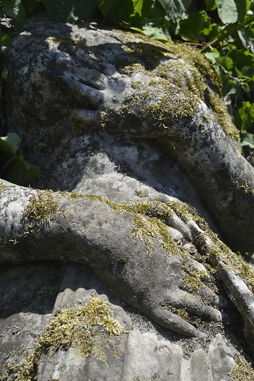
Re-visiting the Crystal Palace Statues

I had used these statues as source material for my wax-dipped print from the Millbank show. There is a headless statue of a woman lying down towards the back of these artefacts, and her hands are holding herself across her chest. The hand touching her breast looks like the fingers are sinking into the flesh-stone of the body. The other hand sinks into the carved drapery, but because all is stone it seems that they are delving into her flesh. I like sculptures which seem to defy their hardness, like Bernini's marble figures and Brancusi's heads.


(Left) Bernini Gian Lorenzo, Rape of Proserpine, marble, 1621-1622
(Below left to right)
Constantin Brancusi, First Cry, marble, 1912
Constantin Brancusi, Sleeping Muse, marble, 1910
Constantin Bancusi, Newborn, marble, 1915
'Is this thing I'm holding in my hands a container for a core? Is there a head within it, or is it a head coming into being?'
John Berger, The Shape of a Pocket, 2001


Colour and Composition Planning
I altered the colour of the photograph to make the lichen appear both bodily and decorative, almost tasselled or embroidered. The colour running through most of my works is this rich red, which seems to be jumping out of me at every opportunity in paintings. In contrast to this, I wanted the shadow to appear sea green. I've been playing with coloured lights recently, seeing the effect of contrasting colours on objects.


Red in the Ashmolean, Oxford


Sketchbook, planning each woodblock colour and swatch testing during the printing process
Tracing onto the Woodblocks
My woodcut has 5 layers of colour, so I prepared 5 sheets of thick Shima Ply. I traced each woodblock layer directly from the photograph. This involved printing the photograph to the same dimensions as the woodblock, then layering transfer paper, the photograph and tracing paper onto the woodblock and taping each in place. I then used a biro to trace each colour layer. The tracing paper mapped each layer, and I coloured in each section as I worked so that I could see where I am layering colour. The darker the area of the photograph, the harder it is to trace tone differences, so sometimes I removed the photograph and drew sections by eye. I enjoy this process of mapping the photograph, then revealing the woodblock with its traced design.


Tracing the design onto the woodblocks

Layer 2 design traced onto the woodblock using transfer paper
Carving the Blocks
When the design is traced onto a woodblock, I draw in any 'islands' which are uninked areas helping to support the printing of large cut away sections of the print. I use the cutting tool (hangito) to cut around the areas to be removed. Then I use a carving tool to cut a series of lines adjacent to the cut line. This then allows me to use a flat chisel tool to remove the area cleanly.


Inking and Printing
I work on my woodcuts at home on my own because I need the space, and also I find that I have to work without interruption because so much of getting it right is down to being both thorough and meticulous, but also quick. Because the blocks are so big, nori paste needs to be spread quickly over the surface before it dries, and then ink also applied quickly in layers. I like how critical it feels sometimes to get a good print each time.

Cardboard registration

printing onto Kozo paper


2nd layer of printing
4th layer of printing. This largest woodblock created the lilac border of the print.
Chromatic Aberration and Colour Layering
I like the shifting quality of prints that are slightly off-registered, and I have been noticing some chromatic effects in the woodcut process which I am keen to explore further. I often layer combinations of mint green, lemon yellow and magenta, which creates a kind of pastel CMYK effect in areas. I am interested in the effect of this when depicting light and form, and these shifting ambiguities which occur.

Untitled (detail), Japanese woodcut print on Kitakata Select, 2025
I was reminded by the exhibition Abstract Expressionism at Tate Modern which had a section about colour theory and Franz Marc's use of an 'achromatic doublet prism' to view purer colour for his paintings. The prism or lens reduces or eliminates chromatic aberration, and is mainly used in photography or lenses for telescopes. Chromatic aberration occurs when different colours of light refract at different angles, which can create blurring, distortion and odd colour effects. I continue this research journey over the Summer when I experiment with photographing objects using coloured lights, as well as reading Schopenhauer's On Vision and Colour which takes me into the second half of Unit 3 and my research project.


A painter called Tom Chamberlain, who acted as a visiting tutor on my Fine Art degree, creates paintings using very fine washes of acrylic or watercolour, layered meticulously to create shimmering abstractions. I saw these two paintings at the RA Summer Show and was reminded how beautiful they are to see in reality. They convey more of this sense of the ambiguous, shifting quality of light and colour I am interested in.

On Air, Tom Chamberlain, watercolour on paper, 64 x71cm

Forgetfulness, Tom Chamberlain, acrylic on canvas, 54 x 58cm
Print as Sculpture
Throughout the course I have been investigating how the two-dimensional print might serve as an object, both theoretically and materially. From coating paper in wax and pewter, to using sculptural methods of display, much of my practical experimentation has involved playing in the areas between print and sculpture. In researching devotional ephemera such as reliquaries I have been exploring materials which enframe, prop and weight the edges of the paper print, almost treating the material transformation from print to object as a way to enshrine or preserve, give literal weight and form to meaning.

aquatint on Somerset paper, wax. 2025

Japanese woodcut on Shoji, pewter. 2025

Digital print on Somerset, pewter. 2025

Digital print on Pansion White, plywood, acrylic paint. 2025

Digital Proposal for Summer Exhibition
I wanted to create a larger version of the pewter-edged Japanese woodcut print for the exhibition, which would be floor-based. I wanted the print to have a frame which was fused to the paper of the print, clinging to its edges. This would allow the print to partially stand up as a free-standing sculpture.
For much of the experimentation and testing phase of this, I was convinced that pewter would be too expensive for the amount that I would need. I was also tentative about the process of dipping large sheets of paper into large quantities of molten pewter, as it is difficult and unpredictable on a small scale. Even when I trialled it with small experiments in the wax room at Camberwell, I realised that the temperature of the pewter needed to be fairly exact in order for any pewter to adhere to the paper, and without the paper charring or burning away entirely. I also applied a coat of PVA glue mixed with fine carborundum powder to the areas to be dipped in pewter, and this helped the metal to adhere to the paper.


Tests with Japanese papers, carborundum powder and pewter
I began to experiment with other techniques of creating this material 'frame' which adheres to the surface of the paper. I stuck thin copper tape to the edges of the Japanese paper, which I found materially interesting in itself. Then I was able to pull solder along the copper tape using thick solder with flux core and a soldering iron with a flat edge.


Testing solder on the edges of Japanese paper


I was able to apply solder to even very thin washi papers as the copper tape protected them from the heat and allowed any shape to adhere to the paper. I was interested in the delicate quality of the copper tape on its own. I also created 'finger tip' sized solder which weighted the paper in specific places, rather like feet.
As I used this method on my large woodblock prints, I began to see that the soldered edges became very fragile as I increased the scale, especially on the corners, which were important to bear the weight of any 3D form I chose to bend the print into. I devised a method of wrapping aluminium rods into the edges of the paper, which could then be covered with copper wire and soldered. However, this proved to be even more fragile on the corners of the sculpture.

I spent a lot of time soldering in my gloves and mask before deciding that it was A) too unstable B) lacking the material qualities of the pewter. Pewter encrusts and clings fragiley to the paper, and is various in texture depending on its heat and how it is dipped: sometimes hardening to a high liquid-like shine, and at other times fragmented and grainy, like a dulled crystal. I bought some cubes of pewter and a cast iron cooking pot and melted the pewter on my camping stove in the garden. I worked out how to press the carborundum-covered edges of the paper into the metal with a knife, then scoop it up and allow it to cool and adhere without sliding off. I made several of my prints pewter-edged and selected the best examples for the exhibition.


I will write in detail about the finished objects, my decisions about display, as well as my critical evaluation of the piece later in this section of the Online Platform. Below are some images taken during the installation of the exhibition.


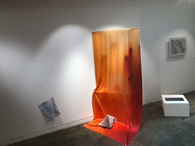
Digital Print on Silk

Previous digital silk print on pillow with volcanic rock

Previous digital silk print wrapped around memory foam
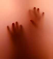
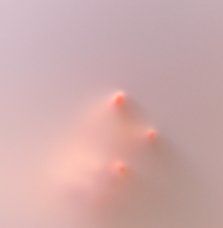
As I had in previous works, I photographed my hand through a sheet of frosted acrylic. I wanted the hand itself to be fogged and receding, but the fingertips to be dense and rounded like buttons. Seen below are a selection of these photographs taken through a sheet of grey acrylic (top row) and pink acrylic variously lit (middle and bottom row).


I used these photographs to create layered compositions with Photoshop. Initially, I made the mistake of sending off an image to be printed on a large scale without getting test prints, and I ended up with a print I really wasn't happy with; the colours were much too dulled and I knew it wouldn't work.


The effect I wanted to achieve was of touching through the stuff of the body. I wanted the photograph to seem as if a screen was pressed against the liquidity of the body, and the screen was to be a haptic interface. For this reason, I layered the meshy patterns over the image to seem like the inner structure of a touch-screen. Touch-screens which use LCD (liquid crystal display) technology use a combination of liquid crystals and touch-sensitive interfaces. These interfaces are a series of grid patterns which map the location and movement of the user's finger over the screen. I created a series of grid/mesh paintings which I layered along with the photographs.

Digital print samples on a variety of fabrics from Contrado

ink and acrylic on watercolour paper
Digital Experiments
As I played around with layering on Photoshop, the effect became more and more bodily, the colours more blood-like. I wanted the colours to mimic my experience of light passing through the eyelids. These edits also remind me of images of babies in the womb, the translucency of the skin and the aqueous surroundings.


Scenography, Staging and Models

Julie Mehretu's painted backdrop for Only the Sound Remains at the National Opera de Paris, 2018
Choosing to print onto silk was always a question of materiality; silk's ability to both reflect light and allow it to pass through makes me think of it as a material screen, something like a fine screen membrane. It also prints digital images very sharply, as I know from using this method in my previous work.
I went to see a production of Moby Dick at The Barbican which used life-size puppets and large swathes of light reflecting fabric, as well as projection, to create mesmerising effects of water, weather and, at one point, the giant eye of the whale which passed darkly over the stage.
I wanted the silk print to act as a staging device for the other works, almost to draw attention to the play of making. The silk entices, and it is not subtle in the least. It stages the other works, and hopefully colours them all with ties to the body.
In researching scenographic techniques, I discovered Michael Levine's huge set design for Madame Butterfly, which mimics both a tiered landscape and a slumped Japanese ink painting. I'm as facinated by the illusion of the staging as the construction of it; I like artworks which have a constructed quality, like Danh Vo's sculptures, .

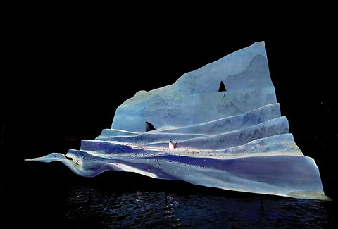
Michael Levine's scenography for Madame Butterfly, 2022

Back view of Michael Levine's scenography for Madame Butterfly, 2022


Danh Vo, Take My Breath Away, Solomon R. Guggenheim Museum 2018
Danh Vo, See Through History and Look into the Future, Winsing Arts Foundation, Taipei 2020
Installing the Silk Print
Once I knew where I would be installing the work, I was able to finalise how I would hang it in the space. I had tested hanging the work at home, but it took being in the space and playing with it in situ, to be able to plan what fixing it needed.
Because I had been assigned an area at the entrance of the space, I was keen for the silk to hang facing outwards, catching the eye and leading the audience to the other works. Once in the gallery space, I was able to ask a coursemate to hold the fabric up a ladder and pull it out from the wall at different angles. I then bent a piece of soft wire into the curve and took it to the metal workshop, where I was really grateful for Daniel's help in making an elegant curved metal frame which I drilled into the wall. I was able to attach the silk to the frame by looping it over and securing it with a series of small magnets at the top.


Resin Cast Woodblock
The woodblock after printing is really beautiful material to me; the way the ink saturates the light wood and how it becomes a map-like relief object. I think of the woodblock as a separate piece of artwork, which as the print's matrix is also the original object. Perhaps as a maker, invested in and fascinated with craft processes, I want the 'stuff' of the printmaking process to be seen and acknowledged. Seen not as a by-product, but brought in as an object or material of its own.
Some woodblocks I will keep with the option of printing from again, but others I will use as an exciting material that has already been activated by process. I have been collecting ideas for relief sculptures for a while, and these have certainly fed into my thought-process:

Alberto Giacometti, View of the Studio, cast plaster, 1936-1939


Nicolas Gambaroff, Quality Interiors (exhibition view at Gio Marconi). cast silicone. 2013

Sula Bermudez-Silverman, amulatamiento, cast glass, sickle guard, 2025
Alex Hubbard, Bent Paintings (why horses paint). urethane cast. 2013
I constructed a wooden mould frame around my biggest woodblock, then painted the inner sides and surface of the woodblock with a shellac mould release. The woodblock was slightly warped from the wet printing process, so I tried to level it out with some props underneath before pouring any casting material into it. I wanted the cast to take on the imperfect qualities of the block, but I was concerned about having enough silicone to fill the mould, so I wanted it to be as level as possible.
I used a glue gun to attach two small pieces of dowel which would cast holes into the piece for fixings. At this stage I wanted the piece to stand upright in the same tall proportions as the silk print, so I had planned to screw the resin piece into a stand. I weighed out the liquid silicone and catalyst, mixed and then poured it into the mould, which thankfully filled with just the right amount.


When I poured out the resin it was very crystallised, which can happen if it is stored below certain temperatures. This can make it very cloudy and liable to not harden. Having planned to work with the resin for the least amount of time and then leave the house to get away from the fumes, I spent a lot of time carefully pouring the resin back into the bottles and then submerging the bottles in hot water to try to make it workable. At this stage I was half expecting the resin not to cure and for the piece to fail...
But, the heat seemed to improve the clarity of the resin and I set about adding the catalyst and the coloured pigment (red and orange) and then pouring it into the mould. I used a brush to apply some dots of extra pigment in the hope that they would mimic the process of ink dotted onto the woodblock during the printing process.


The resin took about 4 days to cure, and when I took it out of the mould I was excited that it had worked, but disappointed that I had chosen to apply the red 'dots' of pigment because they pooled together to become a very different mark, which was very bodily, but not what I have intended. I think if I could make it again I would make the colour much more transparent so that the relief of the woodblock is more apparent. I will write more about the work in the context of the exhibition in a later section of my Documentation.

Cast Woodblock, resin with pigment, 35 x 70cm. 2025

Cast Woodblock (exhibition detail), resin with pigment, pewter. 35 x 70cm. 2025

Cast Woodblock (detail), resin with pigment, 35 x 70cm. 2025
Film Installation
Initially I had the film piece in the 'if I have time' category of my planning. However, as my research shaped the making of my works and writers such as Freedman and Flusser pulled me towards the concepts of surface, limits, screens and haptic interfaces, I felt that it was important to include the digital touch within the works. The silk print designs were becoming more screen-like, and, as with my previous work in the pop-up exhibition, I wanted there to be a tentative, flickering movement in the midst of the works. Derrida's writing in On Touching describes touch as a 'consciousness reverberating in movements’.
He also writes:
‘Our world self-touches itself, it flexes, inflects, and reflects itself; it auto-affects and hetero-effects itself in this way; it folds itself, onto itself and yielding to itself. To be sure, it touches itself so as to become the world, but also to exit from itself'.
This spoke so much about the kind of movement in my previous film, and I thought of re-making this and using a monitor embedded in a plinth instead of the previously projected film.

Camera and tripod set to film downwards onto a frosted grey sheet of acrylic, side-lit

Found plywood plinth with cut-out for monitor screen
For the plinth to be suitable, I had to remove the stand of the computer monitor. However, I discovered after extensive online searching that the stand could not be removed from this old model of Mac without dismantling the whole monitor.
In retrospect, this was a blessing because it meant that I had to re-design and re-make the plinth. During installation, I was able to learn how to construct a plinth from scratch, and finish it to the specifications of the piece, and to a much higher standard. I recieved a lot of help from Matt in the wood workshop to build a series of supports inside the plinth so that the monitor could slide in and out and the screen would sit cleanly against the opening. I also decided to use a router to curve the window of the plinth to make the screen look more embedded in the plinth. In retrospect, I could have routed all of the outer edges of the plinth to make it less box-like, but under the time pressure of the install I just didn't think of it.

Plan for final plinth

Constructing the plinth in the workshops


Tentative (film). Colour monitor, wooden plinth, resin with pigment. 2025
Tentative (film), 3 minutes 14 seconds. 2025
I had previously cast my fingertips in pigmented resin and displayed them on a backlit screen. They worked perfectly on the screen, glowing playfully against the greyness of the film like jelly sweets. I see them traces of touch, slightly abject, but also alluring, appetizing, tactile like buttons. To me, their flat edge as it meets the flat screen, is the part of the exhibition that decribes the 'limit of touch'. There is a world that exists above the screen and world that exists beneath it, like a reflection. I link this with the world that exists within the body touching outwards, and the world that touches back. The skin is the reflective/reflexive surface and the limit between subject and object.
Tentative, exhibition view. 2025
Summer Exhibition,points of critical self- reflection
In some ways, I recall the lead up to the Summer Show as just a blur of making. I was creating pieces simultaneously: completing the Japanese woodcut, casting the resin woodblock, applying soldering and pewter to the woodcut prints. I remember feeling exhausted but really in the midst of making; so much so that the installation days seemed to the be first time that I had considered the piece as a whole.
I found it difficult to envisage the installation spatially because until the installation I didn't know where I would be placing everything. But I think because I enjoy the play of arranging my artworks, and rearranging, (and I realised this more recently when considering the model format for the research festival) a big part of the exhibition experience was laying out all the components and realising it in the space, in the moment.
One of the results of the MA is that I have gained a huge amount of confidence in my own abilities to install and show in exhibitions. From the incredibly positive experiences of the Millbank Tower exhibition and the Summer Exhibition, I feel that I thrived on the experience, and it makes me excited to continue pursuing these kinds of opportunities.

Even though it was stressful at the time, I am so glad that I had to make a new plinth for my film work, because it meant I was able to finish it to the standard I wanted, including rounding off the screen window with the router. In retrospect, I wish I had thought to round off all of the edges of the plinth as I think this would have suited the softness of the other works.
In my original design, I had wanted the large silk piece to be even larger; cascading into the gallery space from the ceiling and running over the floor, completely filling the area like a stage set. But, the digital print was expensive and could only be produced in this width, so the piece was really as big as it could be. I would love to learn to sew and construct larger printed works, thinking about creating worlds that could be entered; stepped through. Ultimately, the silk piece became more of a device, I think of it as a staging device, being more representative of the curtain, the skin. It still presented inhabited the space, and held the other works, particularly the quieter experience of the woodcut print which was behind the silk print.
The pewter-edged works were the most troublesome, because I had imagined them as large A1-sized free-standing prints, standing on textured metal frames made of solder or metal, the metal clinging to their edges. I made many versions of these objects, using large digital prints and aluminium rods, solder and pewter, all in the attempt to make these works. However, I didnt like the quality of the digital print, which being on Japanese paper, was one-sided and which couldn't be a free-standing sculpture from all angles. I also decided, after a lot of soldering, that only pewter had the clinging quality that I wanted. Because pewter is so expensive, I created these smaller works on original woodcut prints. I love the lilac print Paw on the wall; its colours really sung next to the silk print. The other slumped 'creature' I had more problems with. I needed something to sit within the 'stage' of the silk curtain, but I never completely liked the smaller work. If it had been twice the size, I think it would have worked better.
Ultimately, I was really pleased and intrigued actually by what I had produced for the Summer Exhibition. I think if I can be intrigued by my own work on reflection, then it is positive for me. I was so pleased to be awarded the Hausprint Graduate award, and it has given me such a boost as I near the end of the Masters.


Photograph with Michelle Avison from Hausprint Studio